
Wednesday, December 11, 2013
Monday, December 9, 2013
My Favorite Maps of the Semester
Best Lab Maps

I love the neatline and the font used. Both are very original and dynamic

This map has great mimetic symbols that are distinct and humorous! The background looks great.

This map is very crisp looking, and the background is an interesting variation on the gradient effect we have been playing with.

I like the proportional symbols used in this map, and their varied opacity to give better readability

The combination of the background, color scheme, and drop shadow all make this a very aesthetically pleasing and polished map.

I love the use of color in this map to draw the viewer's attention to the London Tube, and I think the composition of the map is really interesting.

The projection of this map is really unique, the design and flow of info is really cool!

This isoline map is great because it has a large range of classes that successfully use many different colors to show differences
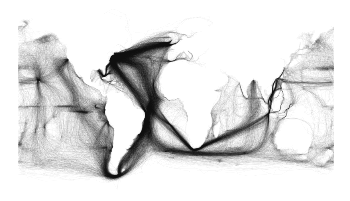
This map is a really cool example of how comprehensive data can speak for itself, because the viewer can make out the continents within the trade routes without any outline of the continents

This topographic map of the moon gives really cool imagery to a landscape we don't usually consider
Handy Illustrator Techniques
After a full semester of using Adobe Illustrator, I have come to really appreciate wide range of abilities and tools the program has to offer, and that's only in the limited context of beginner map making!
My favorite tool so far is the scale tool. This is certainly not unfamiliar to most students in our class, but I have found it invaluable. The most helpful application of the scale tool for me was to make my maps the optimal size for posting on my blog. At the beginning of the semester, I was having problems with the size of my map posts; mainly that they were too small to be able to see the details and smaller texts that were easily visible on Illustrator or in printed version. I found that once I was finished with a map, I could use the ctrl+a command to select everything and scale it by right clicking and selecting transform > scale and adjusting the percentage to make it all larger but still proportional, and the exported jpeg that I posted on my blog was nice and large enough to show all the details I worked to perfect.
Another tool that I found useful was the grouping tool. You can select multiple items by holding shift while clicking them to select. Once they are all selected you right click them and select "group" to group them together. Once items are grouped, you can click on one of them and they will all be selected, and you can move them together as they stay locked in their relative positions to one another. You can also scale them, change color, and do a number of other effects on them while they keep their form. I found this especially helpful for legends that I made and took the time to make sure were perfectly aligned. Once you have achieved the effect you want, or you want to change something within the grouping, you can right click again and select "ungroup" to undo the grouping feature.
Thursday, December 5, 2013
Map of Super Typhoon Haiyan
A map of Super Typhoon Haiyan and how it compares to the Philippines and the United States


Monday, November 18, 2013
Lab 10: Bivariate Map
Lab 10: Bivariate Map

A bivariate map showing the relationship between graduation rate and poverty, using a choropleth map with two sets of sequential data.
Example of a Bivariate Map
Example of an Interesting Bivariate Map

This is a really interesting example of a bivariate map showing Australia's climate using color, as well as other features using symbols. The color scheme is great because it looks earthy and natural, while still having enough contrast to show changes in trends.
Subscribe to:
Posts (Atom)