
Wednesday, December 11, 2013
Monday, December 9, 2013
My Favorite Maps of the Semester
Best Lab Maps

I love the neatline and the font used. Both are very original and dynamic

This map has great mimetic symbols that are distinct and humorous! The background looks great.

This map is very crisp looking, and the background is an interesting variation on the gradient effect we have been playing with.

I like the proportional symbols used in this map, and their varied opacity to give better readability

The combination of the background, color scheme, and drop shadow all make this a very aesthetically pleasing and polished map.

I love the use of color in this map to draw the viewer's attention to the London Tube, and I think the composition of the map is really interesting.

The projection of this map is really unique, the design and flow of info is really cool!

This isoline map is great because it has a large range of classes that successfully use many different colors to show differences
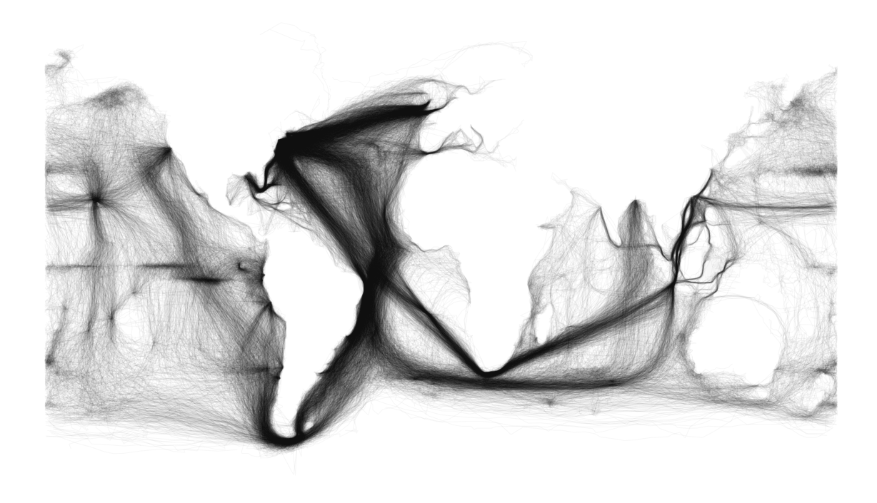
This map is a really cool example of how comprehensive data can speak for itself, because the viewer can make out the continents within the trade routes without any outline of the continents

This topographic map of the moon gives really cool imagery to a landscape we don't usually consider
Handy Illustrator Techniques
After a full semester of using Adobe Illustrator, I have come to really appreciate wide range of abilities and tools the program has to offer, and that's only in the limited context of beginner map making!
My favorite tool so far is the scale tool. This is certainly not unfamiliar to most students in our class, but I have found it invaluable. The most helpful application of the scale tool for me was to make my maps the optimal size for posting on my blog. At the beginning of the semester, I was having problems with the size of my map posts; mainly that they were too small to be able to see the details and smaller texts that were easily visible on Illustrator or in printed version. I found that once I was finished with a map, I could use the ctrl+a command to select everything and scale it by right clicking and selecting transform > scale and adjusting the percentage to make it all larger but still proportional, and the exported jpeg that I posted on my blog was nice and large enough to show all the details I worked to perfect.
Another tool that I found useful was the grouping tool. You can select multiple items by holding shift while clicking them to select. Once they are all selected you right click them and select "group" to group them together. Once items are grouped, you can click on one of them and they will all be selected, and you can move them together as they stay locked in their relative positions to one another. You can also scale them, change color, and do a number of other effects on them while they keep their form. I found this especially helpful for legends that I made and took the time to make sure were perfectly aligned. Once you have achieved the effect you want, or you want to change something within the grouping, you can right click again and select "ungroup" to undo the grouping feature.
Thursday, December 5, 2013
Map of Super Typhoon Haiyan
A map of Super Typhoon Haiyan and how it compares to the Philippines and the United States


Monday, November 18, 2013
Lab 10: Bivariate Map
Lab 10: Bivariate Map

A bivariate map showing the relationship between graduation rate and poverty, using a choropleth map with two sets of sequential data.
Example of a Bivariate Map
Example of an Interesting Bivariate Map

This is a really interesting example of a bivariate map showing Australia's climate using color, as well as other features using symbols. The color scheme is great because it looks earthy and natural, while still having enough contrast to show changes in trends.
Monday, November 11, 2013

Example of a Dot Density map
Example of a Dot Density Map

This is a cool example of dot density map which shows smartphone use by tracking Tweets and type of smartphone. The dots represent numbers of Tweets, which the color represents the type of smartphone used.
Example of an Isoline Map
Example of an Isoline map

Source: http://www.atmosp.physics.utoronto.ca/SPARC/News16/16_Canziani.html
Example of Proportional Symbol Map
Example of a Proportional Symbol Map

Source: http://wiki.cns.iu.edu/display/CISHELL/Proportional+Symbol+Map
Thursday, November 7, 2013
Final Project Proposal
Title: Smartphones, A worldwide phenomenon
Description: Smartphones are used worldwide, and by a wide range of ages and societies. As an avid user of my smartphone, I am curious to know the habits of other people around the world. For my final project, I would like to do a world map of smartphone users, and I would like to use a proportional symbol technique. I would like the symbol to have two aspects, size and color/fill, to indicate the volume of users for each country, and the most widely used brand/design/type in that area.
Audience: Current smartphone users, people who don't use smartphones but are considering trying it, advertisers who want to better utilize social media/apps, business owners who want to better utilize social media/apps, People who are developing new software, applications, and new sites.
Technique: Proportional symbols and color aspects
Scope: Worldwide, major cities or regions
Data Specs: I am having trouble narrowing down a source for my data, but I know I will need the statistics for number of users in each country and of which social media tools/sites. I found a good source which gives info about providers, brands, and other smartphone/mobile phone statistics for major world regions
http://mobithinking.com/mobile-marketing-tools/latest-mobile-stats/a#subscribers
Basemap: I will need a basemap of the entire world
Production steps:
The first step will be to locate data and arrange it according to most users per country
The second step will be selecting a symbol then creating proportional symbols for each country
The third step will be strategically placing these symbols so that they accurately represent the area but allow maximum readability
Possible challenges: Finding good data has already proved challenging. It is also possible that my scope is too large, and maybe I could focus on a smaller area if it becomes too overwhelming. An issue I encountered with my proportional symbol map in our previous lab was that the data range was too high, making the smallest symbol almost impossible to see, and the largest symbol bigger than the basemap. I also want to make sure I'm accurately representing worldwide statistics, I suppose the data by region might be slightly skewed or arbitrary.
Here are a few inspiration maps:


Description: Smartphones are used worldwide, and by a wide range of ages and societies. As an avid user of my smartphone, I am curious to know the habits of other people around the world. For my final project, I would like to do a world map of smartphone users, and I would like to use a proportional symbol technique. I would like the symbol to have two aspects, size and color/fill, to indicate the volume of users for each country, and the most widely used brand/design/type in that area.
Audience: Current smartphone users, people who don't use smartphones but are considering trying it, advertisers who want to better utilize social media/apps, business owners who want to better utilize social media/apps, People who are developing new software, applications, and new sites.
Technique: Proportional symbols and color aspects
Scope: Worldwide, major cities or regions
Data Specs: I am having trouble narrowing down a source for my data, but I know I will need the statistics for number of users in each country and of which social media tools/sites. I found a good source which gives info about providers, brands, and other smartphone/mobile phone statistics for major world regions
http://mobithinking.com/mobile-marketing-tools/latest-mobile-stats/a#subscribers
Production steps:
The first step will be to locate data and arrange it according to most users per country
The second step will be selecting a symbol then creating proportional symbols for each country
The third step will be strategically placing these symbols so that they accurately represent the area but allow maximum readability
Possible challenges: Finding good data has already proved challenging. It is also possible that my scope is too large, and maybe I could focus on a smaller area if it becomes too overwhelming. An issue I encountered with my proportional symbol map in our previous lab was that the data range was too high, making the smallest symbol almost impossible to see, and the largest symbol bigger than the basemap. I also want to make sure I'm accurately representing worldwide statistics, I suppose the data by region might be slightly skewed or arbitrary.
Here are a few inspiration maps:
Tuesday, October 29, 2013

Tuesday, October 22, 2013
Lab 7: Symbols Map

This lab was originally a proportional symbols map, but due the extremely large range of values for my data, I ended using a graduated symbols map, with a different color for negative values.
Example of an Interesting Color Map

This map, which relates education level to income, is a very interesting example of color. It layers three different monochromatic maps of different information in order to show how they relate. It is an interesting concept, but it does have some confusing areas, where one can't tell which colors are mixing and how dark or light they originally were.
source (with zoom abilities):
http://awesome.good.is/transparency/web/1101/census-data/flat.html
Monday, October 21, 2013
Lab 6: Color Choropleth Map
Lab 6: Color Choropleth Map

When comparing this online post of my color map with the printed version, there are noticeable changes in the colors. The background in my post is darker and more prominent than in the printed version, where it is much lighter and less distracting. For the values, the second to lightest green (.00031-.00060%) is the most dramatic change, it looks slightly darker online than on paper. The lightest value and darker values look the least changed.
Wednesday, October 9, 2013
Lab 5: Grayscale Choropleth Maps
Lab 5: Grayscale Choropleth Maps


For my two versions I did a natural-breaks map and an equal-interval map. There is a significant difference between the two. The natural breaks map seems to have a more even distribution between the five classifications, while the equal interval map has a high concentration in two of the classifications, and only a few in the others. The natural breaks map looks better aesthetically to me, but it might have misleading information. The even interval might be better, because it gives a more realistic view of the information, which is that many states have about the same ratio of exotic animal incidents.
Tuesday, October 8, 2013
Example of a Choropleth Map
An example of a Choropleth Map:
HIV Epidemic among Young Thai Men, 1991–2000

Figure 2. Choropleth maps of HIV prevalence in four classes of young men at time of entry into the Royal Thai Army, Thailan, 1991-2000. Location determined by residence during the previous 2 years. Prevalence is stratified by color and localized to district or group of districts so that calculations are based on > 20 men
Kalyanee Torugsa*, Scott Anderson†, Nucharee Thongsen*, Narongrid Sirisopana*, Achara Jugsudee‡, Pitak Junlananto‡, Sorachai Nitayaphan*, Suebpong Sangkharomya*, and Arthur E. Brown*
Monday, September 30, 2013

Tuesday, September 24, 2013

Wednesday, September 18, 2013
Typography & Design

This map, a Technology "Game of Thrones" map, is a great example of beautiful typography and design. The text is strategically placed so it is clear what each label is attached to. The words and phrases form to fit the shapes of what they label, and the font is cleverly selected to suit the medieval theme. The subtle changes in color are a nice touch, because they give enough contrast with their respective backgrounds to make them easy to read.

This typographic map of Washington, D.C. is another really interesting example of the use of type to enhance the design of a map. The text is shaped and repeated to form the actual space and shape of the object it is labeling.
Tuesday, September 17, 2013

Thursday, September 12, 2013
Map Projections
Projections at identical scale with maximum angular deformation
values represented by colors


Map in sinusoidal (Sanson-Flamsteed) projection: equal-area, but only the Equator and central meridian are free of angular deformation

Polyhedral maps are a particular case of interruption. On an unfolded Waterman polyhedron, the gnomonic projection centered on faces is azimuthal, therefore the deformation pattern is radically symmetric.
Source: http://www.progonos.com/furuti/MapProj/Dither/CartProp/DefPatA/defPatA.html
Thursday, September 5, 2013
Lab 1: Illustration of Sphere, Geoid, Ellipsoid, and Natural Surface
Lab 1: Illustration of Sphere, Geoid, Ellipsoid, and Natural Surface

Thursday, August 29, 2013
Interesting (Perspective-Changing) Maps
Black Rock City over the Golden Gate Bridge

This map shows "Black Rock City," the camping city that is set up annually for Burning Man Festival, super-imposed over the Golden Gate Bridge. It gives an interesting perspective on how large the festival grounds actually are.
Source: http://matadornetwork.com/bnt/20-maps-that-will-change-the-way-you-see-the-world/?utm_source=fb&utm_medium=social&utm_campaign=promo
More info about Black Rock City: http://www.burningman.com/whatisburningman/about_burningman/brc_growth.html
The Pyramids of Giza over Angkor Wat

This map shows an aerial view of The Pyramids of Giza super-imposed over Angkor Wat in Cambodia. People usually think of the Pyramids as being some of the most massive structures on earth, but they are dwarfed by Angkor Wat, which could fit all the pyramids and the sphinx, as well as Taj Mahal and its gardens!
Source: http://matadornetwork.com/bnt/20-maps-that-will-change-the-way-you-see-the-world/?utm_source=fb&utm_medium=social&utm_campaign=promo
More info about Angkor Wat http://whc.unesco.org/en/list/668
Subscribe to:
Posts (Atom)