Best Lab Maps
I love the neatline and the font used. Both are very original and dynamic
This map has great mimetic symbols that are distinct and humorous! The background looks great.
This map is very crisp looking, and the background is an interesting variation on the gradient effect we have been playing with.
I like the proportional symbols used in this map, and their varied opacity to give better readability
The combination of the background, color scheme, and drop shadow all make this a very aesthetically pleasing and polished map.
I love the use of color in this map to draw the viewer's attention to the London Tube, and I think the composition of the map is really interesting.
The projection of this map is really unique, the design and flow of info is really cool!
This isoline map is great because it has a large range of classes that successfully use many different colors to show differences
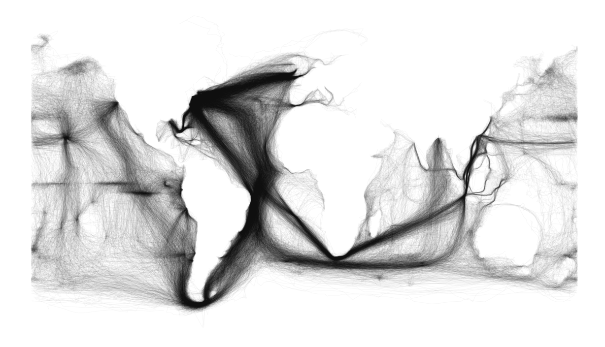
This map is a really cool example of how comprehensive data can speak for itself, because the viewer can make out the continents within the trade routes without any outline of the continents
This topographic map of the moon gives really cool imagery to a landscape we don't usually consider


No comments:
Post a Comment